This article was originally published by DAVID SCUTT on APR 4, 2018 via businessinsider.com.au
- Australian home prices were flat in March, leaving the increase on a year earlier at 0.8%, well below the double-digit gains seen in early 2017.
- Prices were higher in regional areas and smaller capital cities, offsetting weakness in Sydney and Melbourne.
- Westpac says weakness in the top end of Australia’s housing market has led the recent national slowdown.
Australia’s housing market is slowing down, led by the nation’s largest and most expensive city, Sydney.
However, as has been well documented, Australia is not one housing market, but many, with prices in many locations actually moving higher as those in other regions fall.
Indeed, while Australian home prices were flat in March in average weighted terms, according to data released by CoreLogic, prices in regional areas actually increased, as did those in all capital cities aside from Sydney, Melbourne and Adelaide.
And it wasn’t just by location where price divergences were seen, but by dwelling values, too.
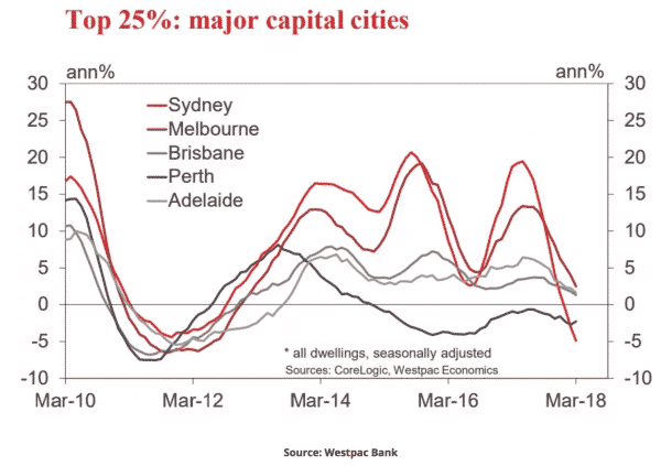
As seen in this excellent chart from Westpac Bank, the national slowdown largely reflects a steep reversal in prices in the top end of Australia’s housing market, a performance in stark contrast to the upswing of the price cycle where these properties outperformed.

While less-expensive segments of the housing market have also slowed, to date, they still remain in positive territory on an annualised basis.
According to Matthew Hassan, senior economist at Westpac, the recent underperformance of the top end of the market reflects weakness in Sydney and Melbourne.

“The detail shows the epicentre of the [Sydney] slowdown is houses at 3.8%, and particularly those in the upper end of the market at 6.5% over the year,” he says.
As seen in this next chart from Westpac, it’s a similar story in Melbourne with the top end of the market slowing significantly faster than in other major capital cities.
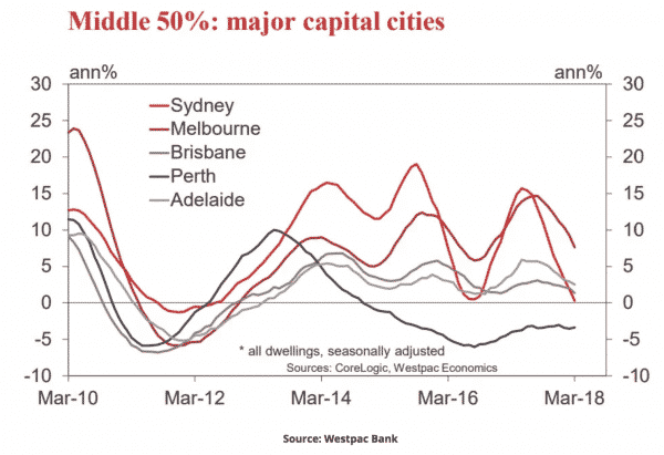
However, at the other end of the housing valuation spectrum, annual price growth has held up considerably better over the past year, likely reflecting strong levels of population growth, less affordability constraints and the introduction of stamp duty concessions for first time buyers in New South Wales and Victoria.
This chart from Westpac shows the annual price change for properties in the middle 50% of valuations.
And this is the same chart, only for the bottom 25% of property valuations.

The charts provide an excellent reminder that while price growth is slowing nationally, it largely reflects weakness in the top end of the market, especially in Sydney and to a lesser degree in Melbourne.
It’s a case of the bigger the price, the harder the fall, at least on this occasion.